Method
Year 2012 /
Agency NCS /
My Role UI/UX Designer / Visual Designer /


A detergent brand built on the idea of dedication to making earth more eco-friendly. Method started with the making of non-toxic ingredients and is always surrounded by the issue of being green. The evolution of this product proceeds from the early stage of finding out the skin-friendly formula to that of now putting more emphasis on bottle design. The appearance has become another driven factor to customers willing to pay more money for the Avant grade design. Method cares about their customer just as much as the efforts they put on protecting the earth.
Go Green /
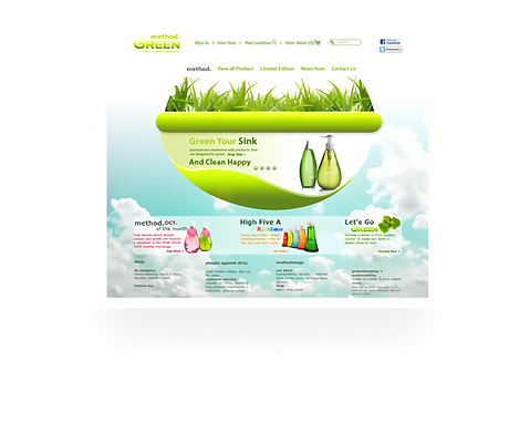
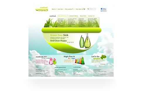
Method product has been circling around a principle for their dedication to making the environment better. Go green has always been a faith and message they deliver to the customer. And which also becomes the core value for this website we design. We want to design an approachable website with the little botanic vibe. Something like bathing in the sun as you can almost smell the fresh air.
#Green
#Environment friendly
#Sun bathing
#Clean
Streamline, Smooth, And Leafy /
Their bottle design is always a big surprise to us and quite inspirational that we think maybe we can get something from there. The streamline, leafy shape bottle is a metaphor for its persistence in having been a pioneer in eco friendly for cleaning detergent industry. We took the idea and sort of creates a smooth pod shape with method products wrapped inside. And above the pod is a patch of grass growing vigorously. The whole set is well bathed in the sun. Our client likes the idea and encourages us to proceed.
#Streamline
#Smooth
#Pod
#Product bottle
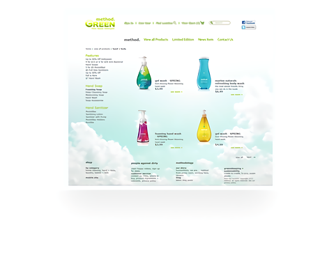
A Better Way To Browse Product /
We bring down the transparency a bit on the background image in order to let product items stand out. Because that's what user comes to visit our site for. We also think about enlarging margins between items from the perspectives of readability and psychology. A bigger product image with clear product details displayed in the user's sight does surge the desire to make a purchase. Another reason for this is to alleviate distraction since those products are painted with many rich colors. Chances are they may decrease the motivation a user wants to continue shopping.
#Readibility #Customer psychology
#Margin
#Color conflict
#user experience
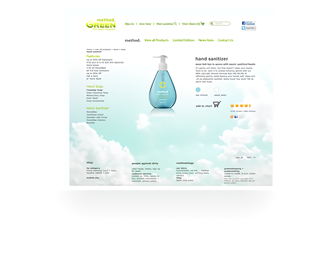
Friendly User Experience Matters /
For the product page, there are much info to be put on. Usually, when user comes to this page, there is a possibility they are about to make a purchase. Out of interest or curiosity, however, this is like a final step to persuade user why they should choose the product rather than others. As a result, from the visual perspective, we want user to feel comfortable and easy to find any info a product requires.
#Product info
#Readbility
#Neat #Clean
#Grid