My Role
Stakeholder Interview Prototype Design
UX Design Data Analytics
User Interview User testing
UX Design
Amos
Year 2016 /
Agency FieC /
My Role UI/UX Designer / Visual Designer /


Cool Gadgets
x Smart City


Amos: Redesigning the Smart Home Experience
Overview /
Amos is an intelligently designed app that acts as a remote control for sensors in a smart home system. These sensors, equipped with artificial intelligence, detect subtle human motion and are interconnected throughout the home. While the app primarily controls these sensors, it also offers a map view that allows users to profile each sensor. The concept of Amos is inherently tied to the sensors, making them complementary in functionality.
Our client has tasked us with redesigning the app to evaluate and fix UI problems and enhance the user experience based on the existing product.
20%

Stakeholder Interview
We decide to conduct a stakeholder interview on client and affiliated staffs, hoping to touch the depths of core value. Since the current version of this app is lacking of planning and looks a bit disoriented, our first job is to sort out what is essence to client and how they want this app to be represent to user.
Stakeholder Interviews /
Current Issues:
-
The UI documentation provided by the client was incomplete and inconsistent.
-
The product's goal and requirements were vague, with significant features buried deep within the app, making them hard for users to find.
Process:
-
We re-interviewed stakeholders to clarify the product’s primary values and future vision.
-
We aimed to understand how the client wanted to enhance the user experience and convey the product's core message.
After sorting out primary values and secondary materials, we focused on identifying the true value of the product and aligning it with the client’s vision. This led to a clearer path for removing unnecessary features and retaining the essential ones.
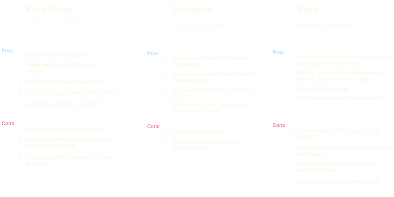
Competitive Analysis and Persona Creation /
Competitive Analysis:
-
We reviewed similar products in the market to understand their strengths and weaknesses.
-
We gathered insights from the client and offered our perspectives to find a balanced approach.
Persona Creation:
-
We recreated personas to reflect the diverse situations of different types of users.
-
These personas were based on client input and online research, serving as valuable references to align with real user needs.
The previous design was feature-heavy based on client preferences, not user validation. Our mission was to identify and implement the actual needs of target users.


Trimming and Restructuring /
Trimming Unnecessary Features:
-
We removed unnecessary features from the previous design, resulting in a more focused and neat app.
-
Discussions with the engineering team ensured feasibility and efficient time management.
Restructuring the App:
-
We maintained clear communication with the engineering team to ensure that the removal of certain features did not disrupt the overall layout.
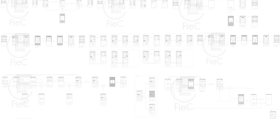

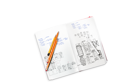
Wireframe and Prototype /
Wireframe Creation:
-
The old app was confusing, with poor organization leading to user hesitation.
-
The trimmed-down version gave us a clear idea of how to guide users through the app.
Prototype Development:
-
Using Invision, we created an interactive prototype from the wireframe.
-
This prototype was used for usability testing to validate the design and gather feedback.
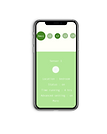
UI Creation /
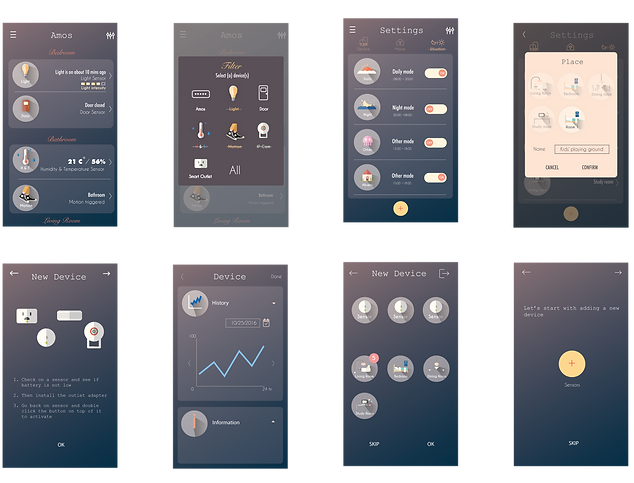
Early Stage Usability Test and GUI Planning /
Usability Testing:
-
Validating the prototype early helps reduce the risk of extensive revisions later.
-
Webcam-based usability tests were conducted, providing valuable data despite not being as effective as in-person tests.
GUI Planning:
-
The client was eager to move to the GUI stage after seeing positive usability test results.
-
Consistent involvement with the project manager and engineering team ensured a cohesive visual design approach.
Design Principles
Storytelling:
-
We created a narrative theme to engage users, using interface elements and props to facilitate interaction.
-
Consistency across pages ensured a seamless user experience.
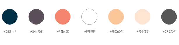
Color Scheme:
-
A well-researched color scheme added depth to the story.
-
Dark colors were chosen for their elegance and personality, aligning with the client’s vision.
Typography:
-
We selected Caviar Dreams Regular for its elongated body and distinct personality, which complemented the color scheme.
-
The font choice reflected a balance of maturity, simplicity, and modern design trends.

Icon Design:
-
Icons were designed to be universal and easily recognizable, minimizing user confusion.
-
Generic icons were validated to ensure they were commonly understood across different platforms.

Conclusion /
Our comprehensive approach to redesigning Amos ensures it effectively addresses the needs of smart home users, integrating seamlessly into their daily routines. By focusing on simplicity, user engagement, and clear guidance, the app aims to make smart home management intuitive and effortless.
