Mutual
Year 2016 /
Agency FieC /
My Role UI/UX Designer / Visual Designer /


My Role
Stakeholder Interview Prototype Design
UX Design Data Analytics
User Interview User testing
Making Mutual is certainly a lot of fun.

Every unforgettable moment comes with surprise and we store these surprises with mutual
Preserving Memories,
Now and Forever.
Pain Points /
The concept originated from recurrent grievances and concerns voiced by individuals struggling to recall the amounts previously expended on red envelopes and gifts during special occasions. Without any tangible reference, the likelihood of accurately retrieving these figures remains minimal.

55%
25%
10%
20%
They have occasionally blundered on significant anniversaries by inadvertently sending the exact same gift they had previously given to the same person.
They often forget either the cost or the intrinsic value of the gifts they have given to friends on special occasions.
They have resorted to downloading an app designed to serve as a reminder for every important event or anniversary, ensuring they do not overlook any significant occasion.
They frequently struggle to recall the precise amount of money they placed in the red envelope for a particular year's celebration.
20%
WE LISTEN, and WE CARE
Through the contextual interviews conducted with target users and focus groups, we unearthed valuable insights into their daily challenges and needs. These findings highlight the obstacles preventing them from leading a more prudent and convenient life.
Focus Group & Interview Conduct /
A cohort of twelve target users (balanced gender ratio of 1:1) was meticulously recruited from outside the company for comprehensive interviews. This focus group comprises office workers, lawyers, business professionals, assistants, and administrators, all aged between 25 and 45, and actively engaged in their social circles. The screening criteria for participants focused on occupations with a high propensity for expenditure on gifts and red envelopes in their various activities.
These participants underwent contextual interviews meticulously designed by our User Research (UR) team. The interviews concentrated on the previously identified issues, with the objective of extracting deeper insights from the participants.
Online Research & Competitors Comparison /
How can we blame them? We are only human. Our memories are often fleeting unless an event is particularly memorable. Even then, those memories tend to fade over time. This issue highlights a significant area worth exploring further, and it may lead us to uncover additional insights through other avenues.
I began searching online for any apps that could meet our specific needs. Most of the apps I found primarily functioned as reminders. These apps are typically used to track spending or record daily trivialities, and they lack the flexibility we envisioned. This sparked an idea: what if I could design a customized app to capture every important moment, date, anniversary, and gathering, complete with photos and detailed descriptions? However, before we can determine the feasibility of this idea, we need additional support and validation.


Data Collection & Key Factors Extraction /.
We gathered opinions from the interviewees and subsequently analyzed this data alongside information on existing online competitors. This comprehensive analysis allowed us to identify the strengths and weaknesses of the comparison materials. Consequently, we determined what elements to incorporate into our concept. These insights, which we refer to as "key factors," will be instrumental in shaping the framework of our structure.


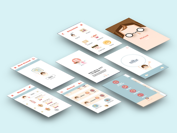
Wireframe & Portotype /.
Once the key factors are confirmed, the next stage involves constructing a convincing architecture and developing a smooth, user-friendly workflow. Typically, the text flow is developed before the UI flow, although this can vary based on the schedule. Our primary goal is to ensure that users feel comfortable and unpressured when interacting with the interface. To achieve this, we generally conduct a quick preliminary usability test using a low-fidelity design prototype.
Early Stage Usability Test & GUI Planning /
After the initial usability test, there is always room for improvement and new insights from testers. To enhance user-friendliness, the flow must be smooth and comprehensible. Additionally, we can elevate the quality by refining the architecture to better align with users' expectations. Following the second revision, we are prepared to proceed with GUI planning.
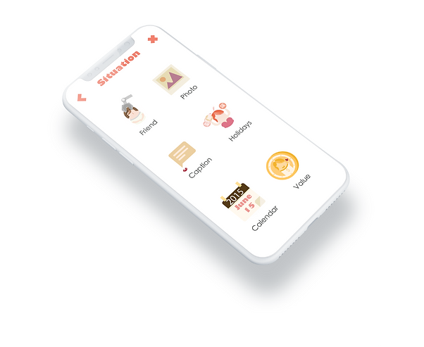
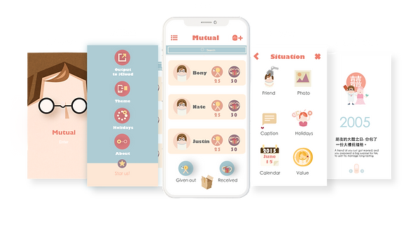
1. Instructional Pages Added to Guide Users from the Start /
A series of instructional pages is created to guide users. These pages convey the core values, showcase the app's personality, educate users on how to operate the app, and save time on self-learning new features.
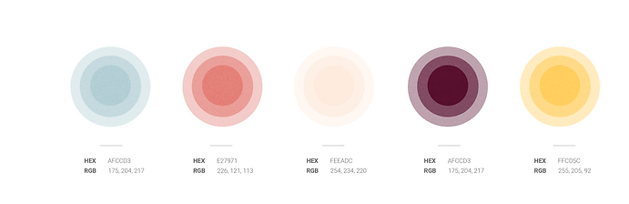
2. Boldness in Red, Euphoria in Mud-Blue, and Activeness in Other Colors /
Given our focus on the red envelope, the vibrant red color naturally emerged as our primary choice. While mud-blue might seem to conflict with red, I personally view it as a complementary color that harmonizes well with most other colors. I aim for the app to have an artistic and distinctive design, so I incorporated numerous hand-drawn illustrations for theme customization (see below).
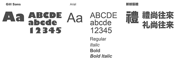
3. Keep it Consistent /
To maintain a cohesive design, we apply the same principles to our font choices as we do to our color palette. The goal is to avoid overcomplicating the design or making it resemble a font collection. Simplicity is key.
4. Be Creative in Icon Design but Keep it Universal and Uncomplicated /
The rule of thumb for icon design is to ensure consistency in style, making sure they appear to belong to the same family. When icons are more metaphorical, captions are added beneath them for clarity and better explanation.


5. Every Sticker Has a Story /
Creating a simple story within a small circle is challenging. The primary rule, similar to icon design, is to deliver a clear message. It's essential to maintain simplicity and avoid complexity to ensure the message is easily understood.