iCoaster
Year 2016 /
Agency FieC /
My Role UI/UX Designer / Visual Designer /


The iCoaster is an intelligent coaster designed to measure your daily water intake. By connecting the coaster and your smartphone via Bluetooth, you can monitor your hydration habits anytime, anywhere. iCoaster is an innovative solution, especially for people working long hours in an office, ensuring you stay adequately hydrated throughout the day. Let iCoaster be your hydration guardian.
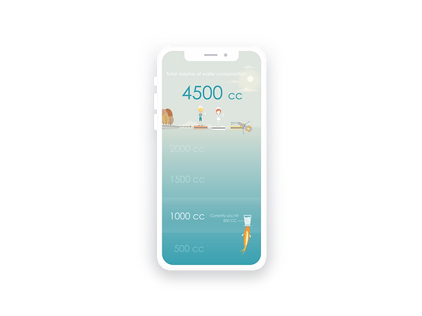
Fresh, Cool, and Clean /
Aquatic Theme: To immediately evoke the image of water, we use an ocean blue color palette with hints of green. The gradient transitions from sky blue to deep ocean bed, creating a refreshing visual impact.
#Aqua
#Theme #Story
#Animation
#Measurement
#Readibility
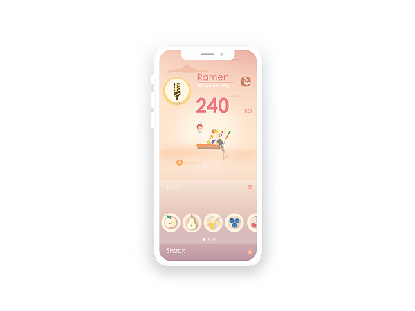
Warm, Energetic, and Positive /
Calorie Measurement: The weight scale feature uses a warmer color palette to promote a healthy and positive energy. This encourages users to reduce high-calorie foods and maintain a balanced diet.
#Weight Scale
#Calories #Food
#Warm color
#Readibility
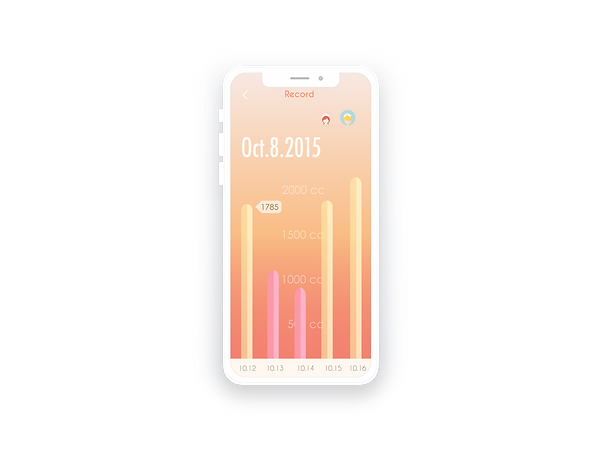
Drinking Patterns History /
Readability and Contrast: The history check section is designed with high readability and strong color contrast. Users can easily access valuable data and drinking patterns. We carefully selected colors to distinguish this section from the main page while maintaining harmony in the overall design.
#Color contrast
#Redibility
#Harmony in colors
# Unit/measurement
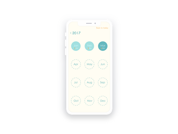
Flexible Time Switching /
Detailed History Access: Users can switch between daily, monthly, and yearly views with ease. This section offers detailed insights into hydration patterns, allowing for clear navigation and a comprehensive overview.
#History
#Calendar
#Flexible switching
#Message hiding in colors
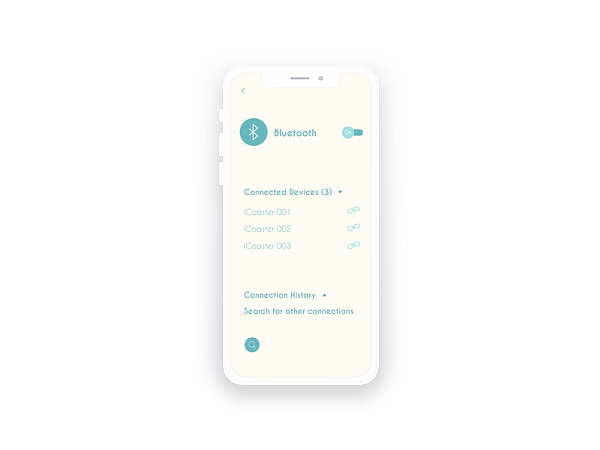
Simple, Neat, but Consistent /
Consistent Visual Design: We maintain consistency throughout the app with a simple and clean visual design. The settings page features the main color scheme for icons, objects, and fonts against a light ivory background. This ensures users feel they are within the same app environment, even when navigating different pages.
#Consistency
#Where's the beef?
#Color scheme
#Harmony

