MandarinOriental
Hotel
Year 2012 /
Agency NCS /
My Role UI/UX Designer / Visual Designer /


Mandarin Oriental Hotel has become a phrase of the combination of luxury, sophistication, and elite service. And that's why we always see respectful celebrities and powerful icons speak for them. The hotel name has developed into a huge brand across continents. To be able to participate in the re-design goes without saying a tremendous honor to me. Since the brand is so huge, the discussion with MOH's PR so sure takes longer than most of the projects I have done. We have learned a lot from MOH's marketing team and knew their target transits from wealthy senior people to the younger generation who can afford the price and want to be well pampered. The collaboration with MOH is precious and for sure, a life chance.
Value Re-assured /
Speaking of Mandarin Oriental Hotel, the first thing that comes to my mind is luxury and celebrity. And so it really is. Before the re-design kicks off, our client wants to make sure if both parties are on the same page to the feel of MOH. We go over the brief history and current website with the client. And ask what kind of image they are expecting to see and to bring to their customer. We learn that a big percentage of customers are those who are so-called loyal customers. And their new target is to appeal the younger generation who can afford a hotel like MOH.
#Hotel value
#Brain storming
#Hotel image
Young Generation Who Can Afford /
Our client hopes to see the newly designed website to be looking young and approachable yet still elegant and elite. To be honest, these two are quite opposite factors that are going to be forged by force. At this stage, we are still not sure about if they would click but it's worth trying. We pick a few images offered by the client and use geometric blocks as decor. Following the color palette of the logo, we now can start working on sub-color palettes. This is my favorite part. Next, we will figure out the font type.
#Value #Spirit
#Needs
#Color Palette
#Geometry

Blend In BG With Materials /
We got image materials from client and they all look professional and well-toned up. Since everything in the background is already looking very rich, one thing we would want to avoid is the font we added in being blended off in the background. We want to keep it clean and simple. Meanwhile, raise readability by distinguishing font from bg is a good way to bring down sharpness a bit. Transparency is another trick to help solid object blends in bg and still looks like a thing.
#Distinguished
#Readibility
#Font
#Transparency
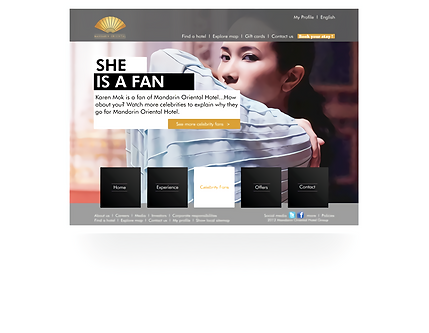
Spokesperson Involved /
We have mentioned about a celebrity when talking about the hotel image. And using celebrity to speak for MOH is a marketing strategy. By summoning fans with celebrity's charisma to persuade loyal fans to book the same hotel room as their idol usually does is clever. For MOH, since their focus is switching over to the younger generation from the older elites, they pick influential people like youtube sensational or singer who can represent this era.
#Marketing strategy
#Influential people
#Spokesperson


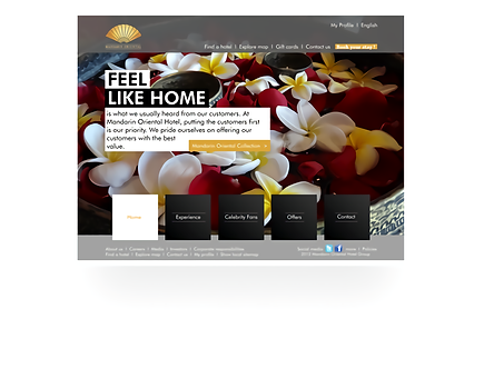
Be Approachable /
MOH picks influential people across the world. And their core value sticks to "MOH makes me feel home" Over the years they want to get rid of the stereotype as snobby and elite only which reflects on the dropping booking rate in overall revenue in recent years.
#Hand drawn
#Caption
#Reference #Information
#Consistency
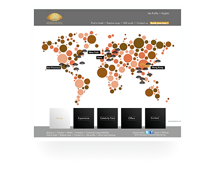
Interactive In Everywhere /
Another fun part is the map design. Our client wants us to list out all the MOH across the world in a more creative way. We ditch the idea of placing a normal world map, instead, we paint numerous dots to puzzle a world map. And when user's mouse hovers over a certain bubble, if the area happens to be a branch, it then shows up geographic info and hotel details.
We want to make user feel that he/she is interacting with the computer.
#World map
#Interactive
#Dots
#HCI
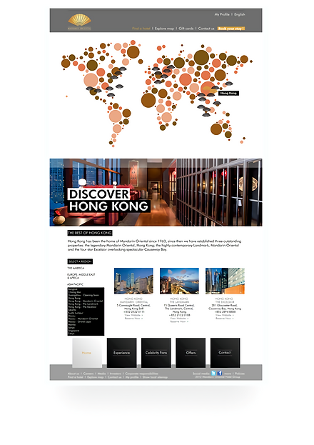
Dynamic Real-Time Diagram /
When user clicks on any branch hotel, there's a page of a chain of gallery and information escalating. Since the redesign has to fit into RWD, the layout changes depending on user's screen size
#RWD
#Hotel info
#Regional